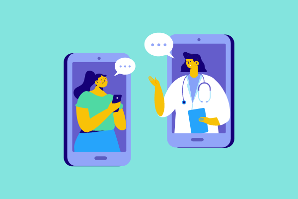

Through a well-designed logo, healthcare brands can successfully engage and increase patient engagement on their website. In a field as revolutionary as telemedicine, a proper healthcare logo design will ensure your company reaches the correct audience.
Instead of searching for free logo design templates, we hope this article provides you with some useful telehealth logo ideas that will help you customize your logo in the best way possible when working with a professional design agency.
To provide you with amazing examples and ideas of how you might construct your healthcare brand design to create the ideal logo, we’ll walk you through 12 companies and their telehealth logos.
Let’s begin!
1. 98point6
98point6 is a virtual clinic with certified physicians that leverages artificial intelligence and automation to service quality primary care at a low cost. Their mobile app offers patients the possibility to conveniently reach physicians. The company offers on-demand access to an affordable, high-quality, and accessible medical service.
Key Logo Design Characteristics for a Virtual Clinic
- The logo design offers a modern, and polished look in line with the optimized service the company offers
- The blue enhances trust and confidence in the brand
- The accent color emphasizes forward and innovative thinking
- The font, with a slim use, adds to the brand’s modern feel
- The logo design offers a slick image that is versatile in its use
- It transfers easily into social media platforms
2. Sesame Care
Sesame Care markets itself as the only American superstore for great doctors and specialists. The platform provides access to convenient, high-quality, full-scope medical care at affordable prices that don’t require insurance. It provides a simple alternative for the health care system.
Key Design Characteristics of a Telehealth Logo Company
- The wordmark design offers a strong statement with a modern feel
- The bright purple transmits innovation, creativity, and leadership
- The font, with a bold type and straight lines, adds confidence
- The icon alternative offers versatility for content
- It transfers easily into social media platforms
3. Plush Care
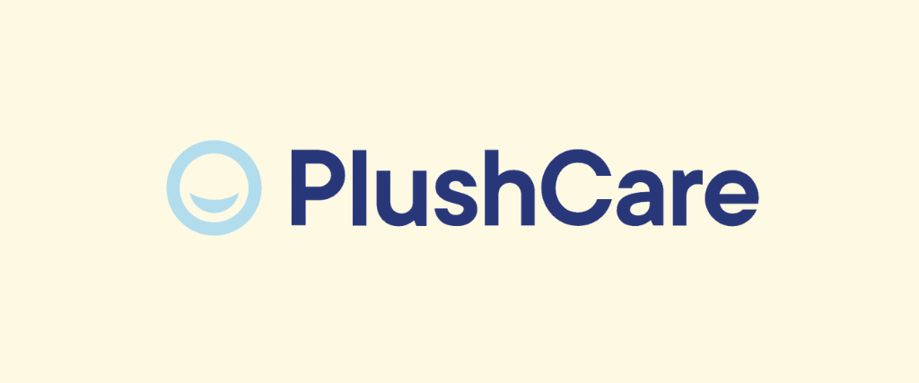
Plush Care offers appointments online, partners with numerous insurance companies, and has a refill prescription service. The services include virtual primary care and mental health treatments in a convenient way. The treatments are personalized and high-quality.
Key Design Characteristics of a Telehealth Logo Company
- The wordmark design offers a professional and serious image
- The contrast in blue hues adds to a current look
- The bold font type and rounded edges transmit a soft look that projects the brand’s accessibility
- The icon is a recognizable feature that hints at happy and satisfied customers
- The icon transfers easily into social media platforms
4. Teladoc Health
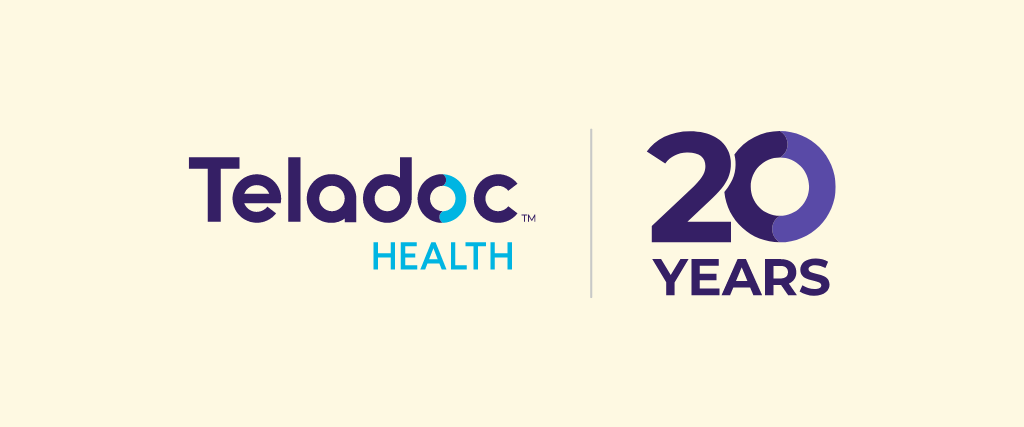
Teladoc Health is the global leader in whole-person virtual care and currently reaching 20 years in the market. They provide virtual care that includes primary care, mental health, chronic condition management, and other services. The company prides itself on the value of its service, transparency, integrity, and quality.
Key Logo Design Characteristics of a Virtual Care Company
- The wordmark design offers a modern, serious, and current image
- The contrast of purple and blue projects the company’s values of quality, professionalism, and integrity.
- The mix of font types transmits seriousness, and creativity, keeping the image feeling fresh and modern
- The “O” with blue and purple transfers as an icon for versatility
5. Walmart Health Virtual Care – MeMD

Walmart Health Virtual Care is the new name of previously telehealth company MeMD, acquired by Walmart Health in 2021. The company maintains the brand’s efforts to provide access to convenient and low-cost health services. Some of those include urgent care for children, teen therapy, women’s health consults, and psychiatry treatments.
Key Design Characteristics of a Telehealth Logo Company
- The wordmark design offers a serious and cohesive logo image in line with the Walmart Corporation
- The monochromatic look transmits a timeless and minimal logo
- The icon reflects the brand’s original image, before its acquisition, and can be seen in use on social media platforms
- The green and blue in the icon reflect balance and hint at the medical industry
6. Health Tap

Health Tap promotes a time-efficient and cost-effective quality healthcare service via virtual platforms. The company’s vision is affordable primary care for everyone by providing long-term access to doctor-patient relationships. Quality verified doctors, and a holistic approach to healthcare are cornerstones of its services.
Key Logo Design Characteristics of a Telehealth Company
- The wordmark design projects professionalism, confidence, and a modern look
- The font type with alterations in some letters transmit innovation and a contemporary image
- The incorporated icon to the first letter adds a unique and stylish element to the overall design
- The use of brighter colors in the icon for social media platforms offers a fresh and more accessible feel for a wider audience
7. Amwell for Patients
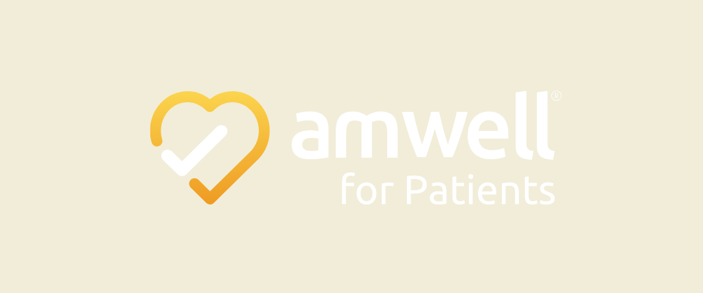
Amwell offers access to live, on‑demand video visits with doctors and therapies. They provide 24-hour services and submit electronic prescriptions. Their services also include insurance coverage for over 80 million people, but services can be accessed without insurance.
Key Logo Design Characteristics of a Telehealth Company
- The wordmark design communicates a modern and minimal look
- The monochromatic logo with a minimal color accent makes it timeless
- The use of bright blue in social media content adds an accessible feel while signaling trust
- The font type transmits a current feel and professional image
- The icon transfers easily into social media and reflects the company’s verified practices and quality
8. MDLive
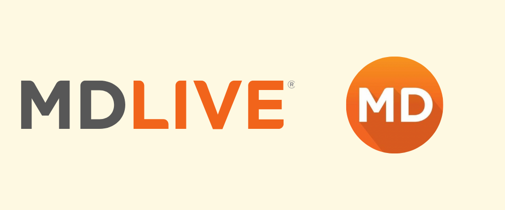
MD Live has built partnerships with healthcare providers in the U.S in its decade in the market. Certified physicians and other healthcare professionals are available 24 hours by phone or online video. The company offers urgent and primary care services, as well as mental health and dermatological treatments.
Key Logo Design Characteristics of a Telehealth Company
- The wordmark design projects seriousness, while preserving a cheerful feel
- The font type with rounded edges adds to a modern and current look that reflects innovation
- The contrast of grey and orange transmits confidence and professionalism
- The bright orange offers versatility for social media content and projects a happy company that caters to a broader audience
9. Doctor on Demand
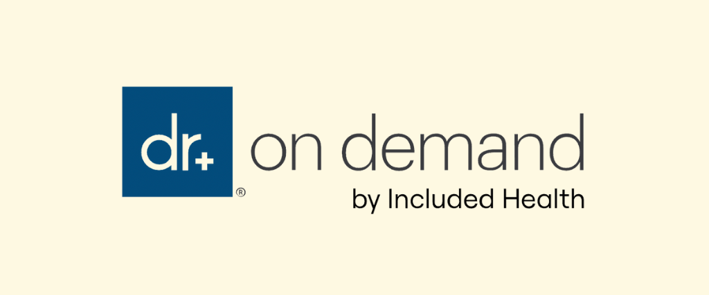
Doctor on Demand the company offers an effective and accessible platform for people to connect with certified doctors and therapists 24/7. The company, founded in 2013, acquired Included Health in 2021, the leading health platform for the LGBTQ+ community. This leads the company to offer a comprehensive and inclusive healthcare service.
Key Logo Design Characteristics of a Telehealth Company
- The abbreviation on the logo offers a modern and current image
- The use of a muted blue projects professionalism, and trustworthiness
- The font type and slim use of it offer a simple but elegant design
- The tagline referring to Included Health is an effective way to communicate the company’s efforts for inclusivity
- The icon transfers easily into social media platforms
10. Live Health Online
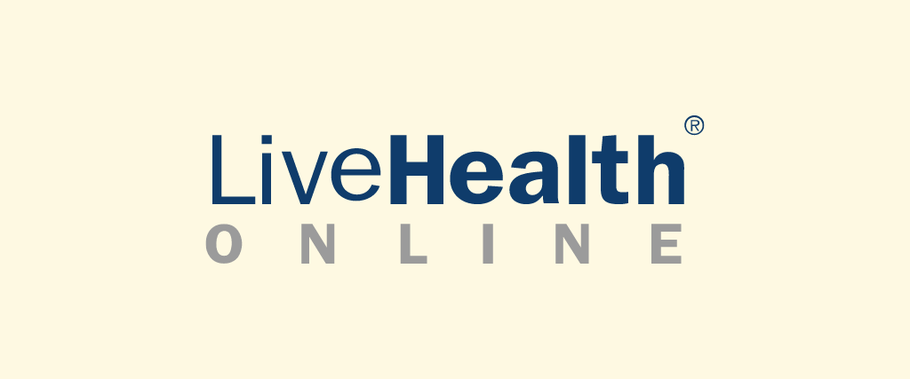
Live Health Online offers medical advice, treatment plans, and prescriptions on a 24-hour availability. They are a low-cost and no-fee platform. Their services include psychology, psychiatry, and allergies.
Key Logo Design Characteristics of a Telehealth Company
- The use of deep blue and grey colors transmit a professional look
- The wordmark’s font variations transmit an innovative, creative, and modern image
- The font type bold and slim contrasts convey the company’s differentiation and modern take on the industry
- The lack of an icon limits the versatility of the company’s image
11. Virtu Well
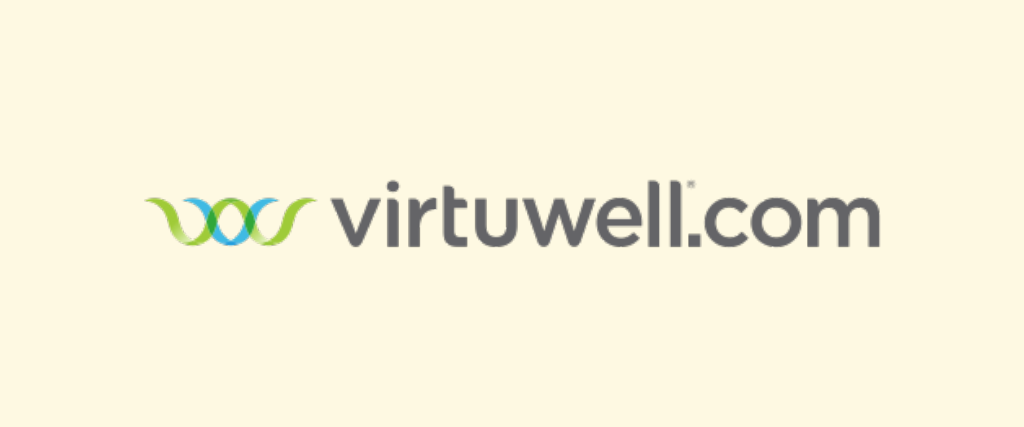
Virtu Well is an online clinic that offers same-day treatments online with certified practitioners. It’s a low-cost healthcare option that provides personalized treatment plans, privacy, and high-quality services. The company prides itself on setting the highest standards for the industry.
Key Logo Design Characteristics of a Telehealth Company
- The simple wordmark and font type offer a serious yet modern look
- The light green and blue pallet conveys trustworthiness, confidence, and accessibility
- The playfulness in the icon references the initial letters of the company’s name, making it unique and identifiable
- The icon transfers easily into social media platforms where purple is used as a contrasting color to convey sophistication
12. Continuous Care for Health
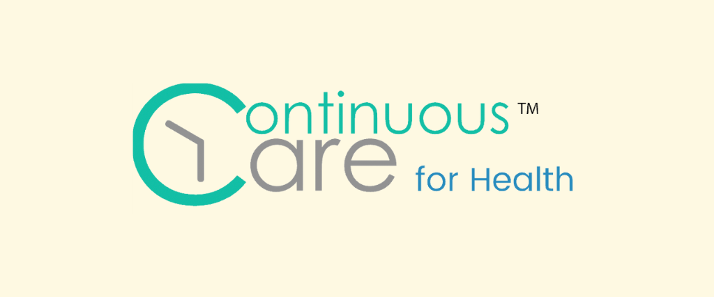
Continuous Care is a software solution for online health providers. It helps them connect with their patients and collaboratively manage their practice through easy data access. It has been developed by NeedStreet, an innovative technological company.
Key Logo Design Characteristics of a Telehealth Software Company
- The clever way in which the wordmark includes the icon offers a dynamic and modern image that engages the user
- The logo feels creative and innovative
- The font type is easy to read which contrasts with the busy design
- The use of pastel blue and green offer conveys freshness
- The icon references the company’s services and transfers easily into social media platforms
Final Thoughts
The businesses reviewed in this article provide several instances of how a logo design and brand may convey an organization’s appearance and values. Some key elements to keep in mind to accurately represent your company:
- Keep it simple by creating a bold wordmark
- Use few colors to create the proper emphasis
- Incorporate the icon of your logo into the wordmark design
- Play with the font type to create engagement
Your logo design will be effective if the message connects with the customers and represents your services.
Keep in mind that professional logo designers, rather than logo generators or online logo makers, know how to create a timeless but adjustable design for your telehealth logo.
Now that you have some inspiration and guidance you know what you should focus on when creating your brand’s image.
Best of luck!